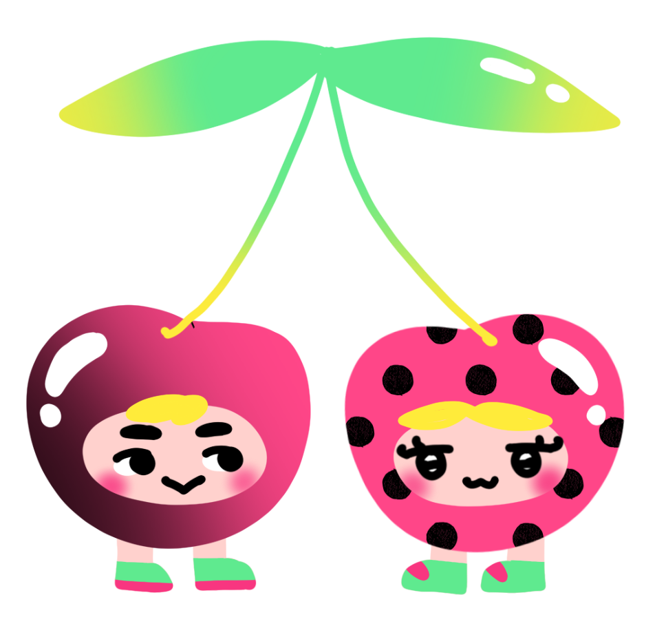
0
Skip to Content
Chaerin
Work
About
Chaerin
Work
About
Work
About

TypeOrbit

Role:

Sole UI designer

The Problem:

When I am choosing a typeface, I often rely on the first impressions before diving into the details of the typeface. However, many type tools I’ve used feel dense and technical, which can make type exploration feel overwhelming and difficult for users to quickly understand a typeface’s personality, versatility, and potential use cases. I wanted to create a simpler and more visual way to engage with type that prioritizes feeling and experimentation.

Process - Designing the Flow:

At my ideating phase, I created a flow chart that represented the screens. I then transferred this visually to low fidelity wireframes. When designing the flow, I made my main priorities simplicity and flexibility. The app guides users first to discover typefaces and then leads them to deeper exploration, starting with browsing and recommendations before moving into detailed views like type overviews and full character charts.

TypeOrbit is a mobile app designed to make exploring a typeface more fun and approachable. The app encourages users to interact with a typeface, explore its full character set, and see how the typeface used in different contexts.

Timeline:

October - November 2025

App Flow

Home Screen: Discovery

The home screen is designed as the main discovery hub. The search bar allows users to quickly find specific typefaces if they already know what they’re looking for.

Below the search, filter options such as serif, sans serif, mood, and appearance allow users to narrow their exploration. These filters are meant to support browsing in case the users have a general idea for what kind of font they are looking for and would like to only view certain types of fonts.

Trending fonts are surfaced at the top to encourage exploration, followed by a complete list of available fonts. This structure supports both discovery and more intentional searching.

Character Chart

The character chart allows users to tap individual characters to view them individually and use a slider to explore different weights. This interaction encourages hands on exploration and mirrors how designers evaluate letterforms in practice.

Full Walkthrough Video:

Design System:

Use Cases

Tools:

Figma

I initially was thinking of adding a “Recently Viewed” section to the Font Library, inspired by browsing patterns in shopping apps. After reviewing the flow, I realized it didn’t add much value and felt out of place within the library. I ultimately removed it and instead decided to add a typeface use cases section within the typeface view, as that would better support exploration and decision making.


Entry: Sign Up / Log In

The sign up and log in screens introduce the tone of the app right away. I used bright colors and playful illustrations to make the experience feel welcoming. Since this is a type exploration app, I wanted users to feel curious and comfortable from the first interaction.

Typeface Detail Page

Reflection - What did I learn?

This project pushed me to think more intentionally about visual hierarchy and its role in guiding users through an interface. My early iterations lacked clarity and felt rigid, which highlighted the need for more deliberate decisions around type size, weight, spacing, and alignment. Through iteration, I refined these elements to improve readability across different font sizes and weights.

Balancing a playful color palette without overwhelming the interface was another key challenge. I found that using neutral tones alongside brighter colors helped maintain clarity while still presenting a sense of playfulness. Overall, this project strengthened my ability to balance playfulness with usability and reinforced the importance of thoughtful iteration in visual design.

Selecting a font card brings users to the typeface detail page. This page begins with an overview that provides essential context, including background information (such as the author, date it was published) and key characteristics. I wanted users to understand both the personality and structure of the typeface before examining it more closely. Character icons are used to communicate personality. I also included written descriptions to support the more technical aspects, such as the x-height and contrast screens.

The use cases section helps users imagine how the typeface might be applied in real projects. As this section appears after the basic exploration and the character chart, the flow supports a progression from discovery to understanding, and then to application.